roshini pochont
Picture Books for Early Learners
As my final graduate project (Graphic Design) at the National Institute of Design, Ahmedabad, India, I was involved in the the creation of illustrations for a series of picture books, for a set of poems based on the theme ‘I Love Earth!’
The project opportunity was offered by KATHA, a non-profit organization in New Delhi that has run successful educational programmes as well as a reputed and award-winning publishing house since 1988.
The book series would also contain activities and games and was meant to be packaged as a learning kit for preschool children (ages 2 to 4).
The design process involved research into the background and context of the project, inspiration-gathering, and explorations in illustration styles and treatments.
The project offered me the chance to not only experiment with illustrations, but also look at the interpretation of themes such as earth and nature awareness for young children.
The initial stages involved gathering information on children’s books, studying pre-schoolers' interests, and analysing how picture books play a vital role in early learning. The final illustrations were created using textural collages.
 |
|---|
After receiving the project brief from KATHA, it was crucial to develop an understanding - as much as the project timeline framework would allow - into how children in the age-group of 2 to 4 years old perceive and interpret their world.
For the child to see the picture book as a gateway to a lush and imaginative world is the perfect way to kick-start the healthy habit of reading at an early age as well. It was also inspiring to discover a variety of styles and mediums used in children's books depicting environmental themes, such as clay, paper collage and watercolours.
For KATHA's 'I Love Earth!' Series, each poem was based on a theme that ties up into the larger idea of loving the earth. The six titles were: 1) Where is Earth? 2) Water is Me! 3) Where is Air? 4) I am Me! 5) Happy in my Space! and 6) Who is better?
Based on broad themes from the contents of each, the poems were then categorized as six major ideas: Earth, Water, Air, Me, Space, and Friends & World. Some of my early explorations in styles and treatments involved rough try-outs
in traditional media such as watercolours, coloured pencils, and collage, along with a few experiments in digital painting.
 |  |  |
|---|---|---|
 |  |  |
 |  |  |
 |
One of the key aspects that had to be kept in mind through the course of the project was coming up with and sustaining a strong visual language across the books. While they each represent distinct, singular themes, the poems also form parts of a larger series, and should hence be identifiable as a unified whole.
One way of maintaining the feel of a ‘series’ would be by basing the visual language on some particular unifying elements, such as colour, characters, structure, or the flow of the narrative.
Through multiple free-flowing brainstorming sessions, I mapped out specific colour palettes and visual metaphors around the central theme of each poem. The moodboard process ended up being highly beneficial, as seeing all the visual references together helped generate even more interesting visual metaphors and ideas for the illustrations.
 |  |  |
|---|
Two months into the project, I had the opportunity to visit the Katha office and the Katha Lab School in Govindpuri, New Delhi. The visit helped me get a firsthand idea of the teaching methods Katha employs in its school, as well as how it uses stories and activities in the unique curriculum.
Katha’s Lab School, set up in 1990, has developed teaching programmes that incorporate story books and non-textbook based lessons into the learning method. Classes are conducted by grouping children according to their ages and learning capabilities. The lessons are focused on getting the kids involved in activities and story-based learning from an early age.
As part of the visit to Katha, I also got to explore their ‘Storyshop,’ a bookstore housing Katha’s growing range of picture
books and children’s literature. The resource archives had many useful references on early learning and art activities for preschoolers.
 |  |  |
|---|---|---|
 |  |
Arriving at a stage in the project with a better understanding of the background and context, it was time to begin fleshing out rough ideas and developing the concepts for the illustrations.
With a total of 24 pages in 12 spreads (11 in. x 8.5 in. A4 landscape), the books would also include activity sheets based on the poems, as well as a large double spread, fold-out poster in the centre.
The poems were broken up into couplets in order to accommodate them within the layout, and also keeping in mind the rhythm of the verses. The first rough thumbnails were pencil sketches based on immediate interpretations of the poems.
 |  |  |
|---|---|---|
 |  |  |
More reference was taken in the form of images of children playing and exploring, in order to understand and capture the spontaneity and verve with which they navigate their surroundings.
While constructing an imaginary world for the books, populated with its own environments and characters, it was crucial
to build up the illustrations with enough detail and richness to lend them authenticity and realism.
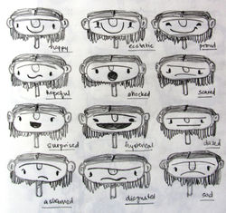
I created a pair of characters, a boy and girl, who would unify the series and also introduce a touch of mischief and play into the poems. These characters would guide the reader through the poems with their presence in each frame.
 |  |  |
|---|---|---|
 |  |  |
 |
Digital style explorations using approximations of gouache paint, oil pastels and charcoal mediums were experimented with, to narrow down a suitable line quality and feel for the style in which the final illustrations would be done.
A cartoony brush style was used for these explorations. A few colour treatments were also explored to decide on colour palettes and moods for each of the environments in the poems.
 |  |  |
|---|---|---|
 |
 |  |  |
|---|---|---|
 |  |  |
I further refined and illustrated the concepts from the first round within the layouts and font placements to check their compositional value.
Laying out the illustrations along with their corresponding texts helped check the rhythm and flow of the poems across the pages of each book.
Alongside the illustrations being developed, the overall book design was also built upon to consider how each whole book would come together with the layouts, covers, end-papers and fonts.
Typeface and font considerations were narrowed down based on conditions that the font should be legible
and age-specific for the early reader audience, as well conveying a warmth and humane feeling to the themes.
 |  |  |
|---|---|---|
 |
I decided to create art with a bright, bold style and simple yet clear forms and shapes to appeal to the preschool
audience. After successful early explorations with textural collage, I took the medium of collage forward for the final
illustrations of the books.
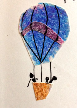
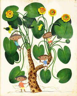
I experimented with digital collages, replicating translucent tissue paper to create colourful, layered illustrations. Another exploration involved using vintage botanical drawings combined with digital characters to create the surreal effect of children playing in and interacting with ‘larger-than-life’ nature scenarios.
 |  |  |
|---|---|---|
 |
For the final prototypes, I chose one spread from each of three poems - Earth, Water and Air - and the concept sketches were used as the foundations over which collages were layered and built.
To generate the effect of a mixed media collage, I scanned and manipulated a variety of fabric scraps, paper textures and other natural materials like leaves and twigs to create layered, multidimensional illustrations.
The final prototypes of the spreads were printed in the actual size of the books - as A4 sized, landscape oriented spreads - in order to get a sense of overall size, legibility and appeal.
 |  |
|---|
 |  |
|---|
The explorations and work done over the course of the entire project were reviewed by a diploma jury panel in order
to assess the quality of work, the process followed, and the way forward.
It was decided that the collage approach should be refined and taken further into creating illustrations for all the poems. Though the project ended here at an exploratory stage, I had reached a sense of a clear path forward with the illustrations and the overall storytelling of the narrative.
 |  |  |
|---|
A full documentation of the project can be downloaded here: